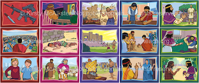
I'm really happy with them - not just "well, it'll do", as I feel some of my recent work has been. (Though of course I can still see bits where it could have been better). It's good to try new things.
 |
| click to see big |
I took the time to shade them - not a lot of time, but makes a big difference.
My new 'inking' technique really worked well - I'll do that again. It completely missed out the middle step - so I went straight from the rough roughs below to final linework.
Not just quicker, but also gives a livelier effect. And since pencil's a more forgiving medium than ink, easier to get a decent result 😀
So the time constraint was a blessing in disguise, as otherwise I would just have done what I usually do.
I tried to hold each story together with a colour scheme - not something I usually do, but I thought I'd try it. Each lesson has two complementary colours, which I've tried to use quite a lot in the picture (not so bright, though!).
 |
| how I did it |
 |
| showing the difference: foreground redder, background cyan-er |


2 comments:
Looking good. I like what you have done with the colours. I think the subtle foreground/background separation works.
Good! It's so subtle I wasn't sure if it was obvious even when I pointed it out.
Post a Comment